Case Study - Sydney Property Data Pipeline & Analysis Tool
A data engineering pipeline that ingests raw public property data and turns it into clean, analyzable suburb-level insights. Built as both a practical decision-making tool and a teaching project.
- Date
- Site
- investmapp.com/
- Roles
- Developer,
- Data Engineer
- Tech
- Python,
- SQLite,
- Remix,
- Fly.io,
- Parquet
Motivation
This project started for two reasons both personal use / interest and for teaching purposes. 1) I'm actively looking to purchase property in Sydney and wanted a clearer, data-driven view of price trends, sales volume, and suburb-level comparisons without relying on opaque or paywalled tools. 2) My brother and a close friend are learning programming with an interest in data analysis and data science. I wanted a project that used real, messy data, required a genuine pipeline, and demonstrated why 'cleaning' and 'sourcing' is where most of the work lives.
Sydney was chosen simply because I live here and the data is locally relevant.
This project is explicitly not a startup. It's a hobby and teaching tool, with some possible future monetisation paths, but the current dataset is Creative Commons / non-commercial (this is a bit of a stretch, but I'm not sure how to make it more commercial without paying for the data).
Data Problems
The raw data came from the NSW Valuer General and presented several real-world issues: Full NSW data, despite only Sydney being relevant, records added years after the actual settlement date, inconsistent schemas across weekly files, excessive columns with little analytical value, inconsistent year and date formats, and no clean geographic linkage to suburb boundaries.
The project quickly became about making the data trustworthy, not modeling or prediction (although why not do this at a later stage? Need more data though, much more!).
Pipeline Design
The system is built as a clear, repeatable pipeline, implemented entirely in Python.
Scheduled Ingestion: A cron job runs weekly to download the latest NSW property dataset. Raw files are checked and validated to ensure expected schema, expected file structure, and no missing critical fields. Invalid or unexpected inputs fail fast before entering the pipeline.
Cleaning & Normalization: Several non-trivial cleaning steps were required. 1) Late-arriving records - Some records appeared in weekly files years after their actual settlement date. These were filtered into a buffer during processing, and after full filtering, they were reinserted into the correct historical date ranges. 2) Sydney-only filtering - The dataset contained all of NSW. I sourced an external list of Sydney suburbs and treated it as a constant reference. This list was used to filter records, validate suburb membership, and align records with GeoJSON boundaries. 3) Column reduction - Large numbers of unnecessary fields were dropped early to reduce noise and storage cost. 4) Date normalization - Different year and date formats were normalized into a single consistent representation. 5) Weekly files were consolidated into yearly Parquet files, sorted by date.
This stage was the most time-consuming part of the project but hopefully the most educational for new learners.
Splitting, Filtering & Analysis
Once cleaned, data is split by time and property type. Quarterly aggregations are computed to reduce frontend payload size and lower the burden on the backend service (monthly analysis is planned later once the server layer is more robust).
Derived metrics include: Median price trends, sales volume trends, price growth over selectable windows, and exponentially smoothed trends to reduce noise and emphasize recent data.
All results are stored in a small SQLite database.
Storage & Deployment
The SQLite database is baked directly into the deployment image (not ideal for long-term, I know). The entire system is hosted on Fly.io. Redeployment occurs automatically after pipeline runs complete.
This keeps the system simple, reproducible, and cheap to operate at its current scale.
Presentation Layer
The frontend is intentionally minimal and built with Remix.
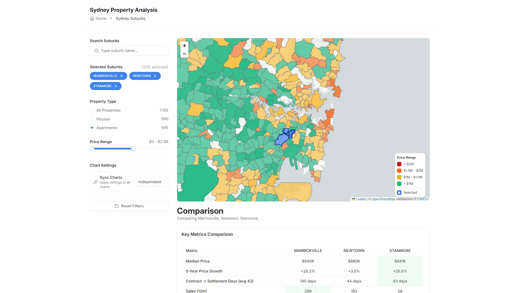
Key features are: A heatmap-based view of Sydney suburbs, selection and filtering by suburb, comparison of up to 10 suburbs simultaneously, toggleable time windows (1, 3, 5, 20 years), and visual comparison of price trends, sales volume, growth rates, and smoothed vs raw trend views.
The UI is designed to answer practical questions quickly, not to impress with visual complexity.
What I'm most proud of here is the comparison feature. It makes trade-offs between suburbs immediately obvious when deciding where to buy.
Teaching Component
A major part of this project is educational.
I set up guided teaching templates where: Learners are given the original messy data, they rebuild the pipeline step-by-step, and the focus is on data validation, cleaning, normalization, and analysis.
Out of scope for learners: Building the Python API layer (just fastAPI), exposing endpoints, and building the Remix frontend.
SQLite-based storage is intentionally included so learners can see the full pipeline without unnecessary infrastructure overhead.
Key Decisions & Trade-offs
Quarterly over monthly aggregation - Reduces complexity and load; monthly can be added later.
SQLite over external DB - Fits current scale and keeps the system self-contained.
Minimal frontend - Focus stays on data quality and usability, not dashboard theatrics.
Sydney-only scope - Prevents premature generalization before the pipeline is solid.
Outcomes
A live, stable property analysis tool used for real decisions, a concrete teaching resource for learning data pipelines, a reusable ingestion and normalization framework, and strong reinforcement that most value in data systems comes from cleaning and modelling, not algorithms.
Reflection
This project intentionally contrasts with my AI-heavy work.
It reinforced that: 'Boring' data engineering is foundational, clean pipelines unlock insight more reliably than complex models, and teaching others forces architectural clarity.
Many of the design instincts from this project now inform how I approach larger systems.
What's Next
Enrich Sydney data... Think stuff like train stations, schools, distance to beaches. Expand to other cities once the enrichment pipeline is solid. Generate suburb-based pages for organic SEO. Continue monitoring real traffic and usage patterns.